Building for Touch Screens: Interaction Media Queries
Published January 31, 2020When you think of a CSS media query, chances are you immediately think of min- or max-width. For most of the history of responsive design, it was enough to check the width of a screen to determine how the page should look and behave. Generally, anything more than 1024px wide was considered a desktop, anything less than 768px wide was considered a mobile device, and anything in between was a tablet.
This worked for a time, but the range of devices has grown considerably in recent years. Not only are the sizes of devices expanding, the features of devices are changing. Things no longer fit into nice buckets. Your tablet might be bigger than your desktop monitor and your laptop might act like a tablet. This makes responsive design harder to grapple with.
Enter Interaction Media Queries. Instead of checking for the size of a screen and extrapolating from that the features of the screen (i.e., touch screen or not), we can directly query the features!
#A Real World Example
Imagine a typical product catalog, with the products neatly aligned in rows and columns. Each cell contains the important bits: an image of the product, the name of the product, and the price or price range. The image and the name also link to the product’s detail page where customers can get a closer look.
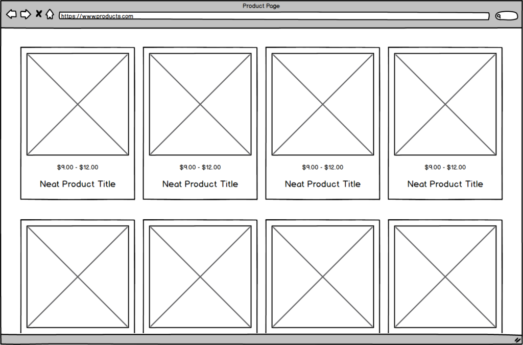
Did you notice what isn’t included in the wireframe above? There’s no way to add to cart. Users also aren’t able to see what options a product may have (does it only come in large and small?) or how much each option might cost. Ignoring the user experience ramifications for the moment, let’s add in a hover state which shows those things!
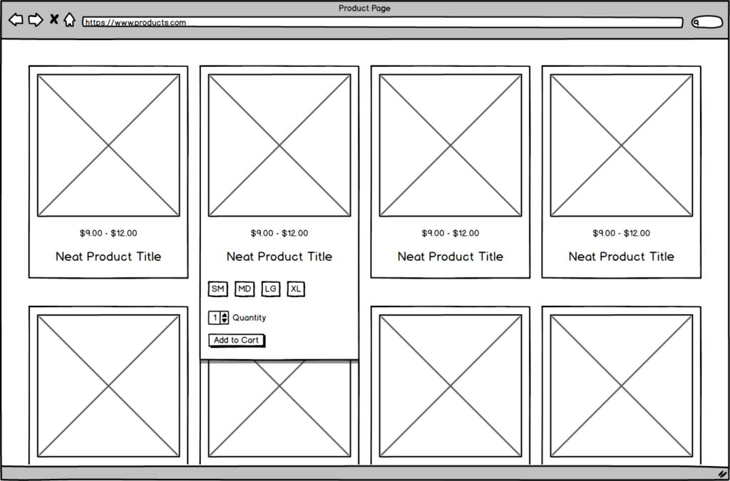
Now when you hover over a product, you can see that the example product comes in small, medium, large, and extra large. You also have the ability to set a quantity and add it to the cart. Great! Done. Let’s mark this task complete and move on.
But wait… there is no hover state on mobile devices! What should we do?
#Historical Solutions
There are three ways to handle mobile devices in this scenario: 1) do nothing, 2) use the traditional width query, or 3) use an interaction media query. If we do absolutely nothing and let the browsers work it out for themselves, users on mobile devices are going to see a brief flash of the hover state when they click on the product; they’ll then be taken to the detail page. This is probably acceptable behavior for some websites, especially if you’re itching to get to production as soon as possible. But I know we can do better.
If we try to use the traditional width query, we’d write something like this:
@media (min-width: 1025px) {
  .product__wrapper:hover .product__overlay {
    display: block;
  }
}
That reads: for any screen that is at least 1025px, when a user hovers over .product__wrapper, show the overlay. For a time, this was appropriate and functional. As I said earlier, though, the days where 1024px equals a tablet are long behind us.
So if we can’t use screen size to determine behavioral patterns, let’s use a different type of media query.
#Introducing the Interaction Media Query
Added in Media Queries Level 4, back in September 2017, interaction media queries determine the primary input of a user’s device. For example, is it a touch screen or does it have a mouse? Based on the result of the query, we can have it serve up different CSS just like we were doing before with min-width! Let’s take another look at our above example:
@media (pointer: fine) {
  .product__wrapper:hover .product__overlay {
    display: block;
  }
}
Now instead of checking how large our view port is, we’re checking to see if a user’s main input provides accurate pointing (e.g., a mouse). In English it would read something like this: For a device that relies mainly on a fine/accurate pointer, when that pointer hovers over .product__wrapper, show the overlay. Viola!
pointer: fine is just one example of an interaction media query. It checks to see if the main input is something like a mouse. There are several other examples, including pointer: coarse which checks to see if the main input is less than accurate (e.g., touch screens), and even one that simply checks to see if a device supports the hover state: hover: hover.
#Downsides
Because we live in an age of such wonderful device diversity, no solution may give you the result you want every single time. A Surface Pro, for example, is considered a device with a coarse pointer (touch screen), but is often used with a track pad (i.e., a fine pointer). This means that even though the Surface Pro is being used like a laptop, the user is seeing the behavior of a tablet.
#Conclusion
We can no longer accurately use screen size to determine what type of device a user has. We should instead query the type of interactions the device supports such as a touch screen or mouse. Interaction media queries give us that power. They are another tool in our responsive toolbox, allowing us to provide better experiences for users. No solution may work in every situation, but the more we understand the tools at our disposal, the better experiences we can craft.
#Further Reading
- Touch Devices Should Not Be Judged By Their Size (CSS-Tricks)
- Using media queries (MDN)